Getting a Makeover: Migration Course Design in Canvas
As our launch of the Canvas learning management system (LMS) approaches, you’re likely wondering what your course will look like in the new platform. Canvas and Blackboard visually present and structure course material in different ways, but the core components will still be the same. Canvas’s streamlined, clean interface gives each course the opportunity for a modern makeover while still using the same content!
Design Process
To develop the Canvas course design for our migrated courses, the Center for Learning Design and Technology (CLDT) formed an internal EP Design Working Group (Working Group) comprised of instructional designers and technologists and a Faculty Canvas Review Committee (Review Committee) of faculty from EP programs. The effort aimed to create a template based on Canvas and instructional design best practices that will be used when migrating existing EP courses in Blackboard to Canvas.
The high-level steps in this process included:
- Building the team: The Working Group was formed from CLDT members. Programs were asked to designate faculty delegates to the Faculty Canvas Review Committee
- Creating the design: Multiple prototypes for each course component (course Home page, Modules area, and course Pages) were crafted and provided to the Review Committee to review.
- Discussing as a group: Meetings to explain the prototypes, discuss feedback, and take notes on necessary revisions between the two groups were conducted.
- Selecting final designs: The Review Committee voted for their preferred prototypes and the results of the voting were shared amongst both groups. Based on additional feedback and the voting results, final designs were selected.
- Documenting decisions: Documentation and design and technical specifications were provided to a contract vendor (K16) to use when migrating EP courses.
Canvas Course Design
Course Menu
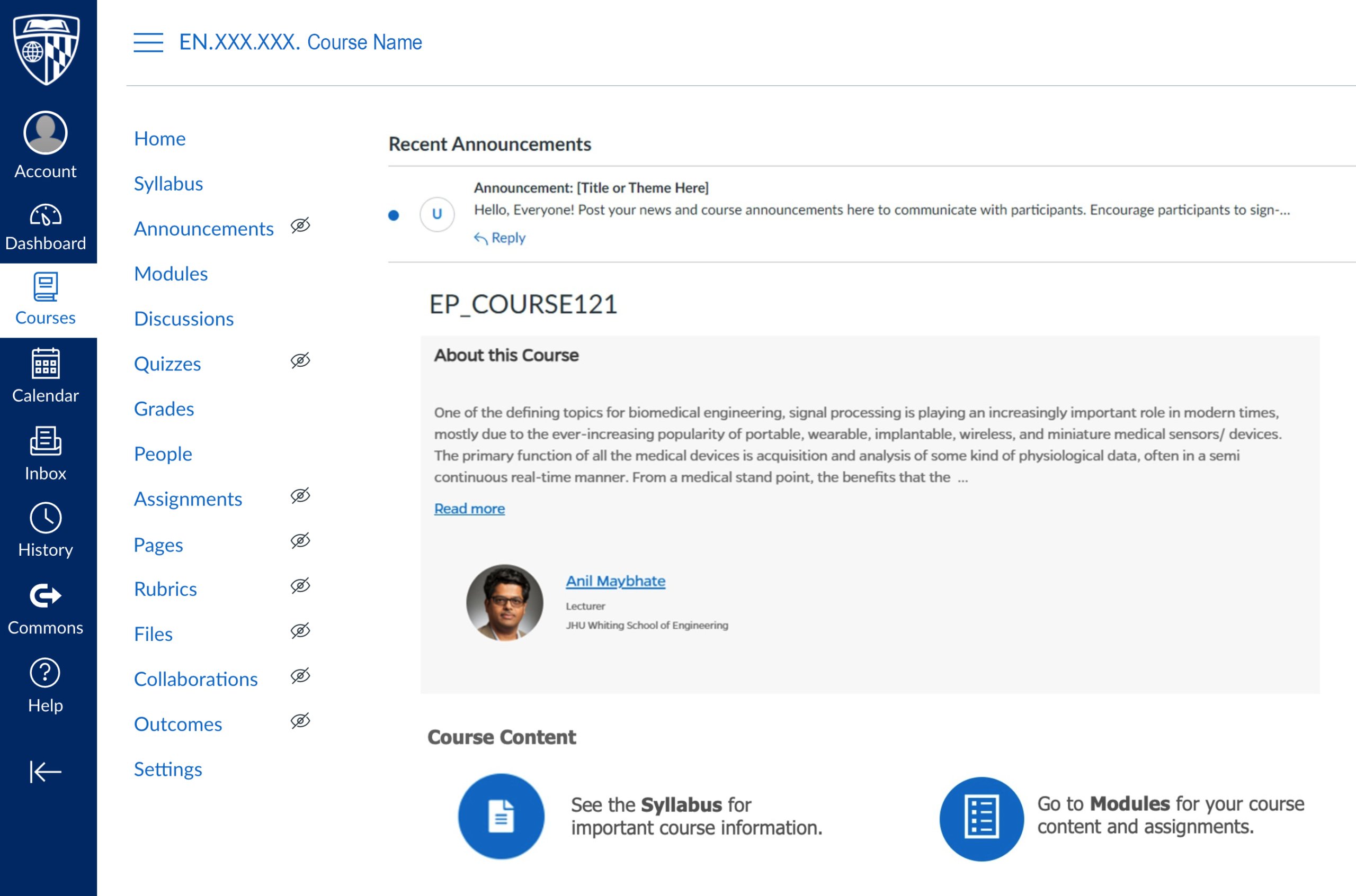
Several factors were taken into account when determining which items to use on the course menu in Canvas including analytic data on which Blackboard menu items were used the most and items that were duplicated on (dark blue). This left a streamlined course menu (white) that contains the essential areas students need to access, mirroring the most important areas in Blackboard courses.
In addition, there are several areas available to instructors that are hidden from students (designated by an eyeball icon with a slash through it) which provide easy access to other course content and tools. In the future, some of these areas may be made visible to students as well.
Home Page
One of the most exciting additions to your course in Canvas will be a course Home page that provides course information and quick access icons to students—all dynamically populated through integrations with SIS and other EP databases. This information is useful at the beginning of the course as students orient themselves and later as they juggle multiple courses. As a bonus, you can customize your course’s Home page as needed or change your course’s entry point altogether once the semester is underway.
One of the most exciting additions to your course in Canvas will be a course Home page that provides course information and quick access icons to students—all dynamically populated through integrations with SIS and other EP databases.

Modules
Modules in Canvas are a little different than they are in Blackboard. In Blackboard the Modules area consists of a list of modules and when the user selects a module, they can view all module content on one page. In Canvas, the Modules area lists the contents of each module of the course all on one page, making it easier for you to get directly to what you want.
Each module is structured on the Modules page as a section that can be collapsed or expanded and contains content grouped into different Pages. If you click on an item within a Module section, it will open a Page that provides the associated course content and submission areas, if applicable. Pages are divided into sections using headers and are highly customizable with images, links, equations, etc. Each Page also has buttons that allow you to move to the next or previous Page in the module, like a book.
Next Steps
CLDT has already implemented the Migration Course Design in our three Canvas pilot courses for the Spring 2022 term. During the pilot, we are gathering feedback from the course instructors and students and will share this data with the Faculty Canvas Review Committee. Based on discussions with the Review Committee, we will finalize the Migration Course Design for use in all Canvas course migrations starting in Summer 2022.
We hope this preview of the Migration Course Design in Canvas will get you excited for the migration and the opportunity for a modern makeover for your course. CLDT will be facilitating as much of this work as possible so that you can spend less time on migration cleanup and more time learning the ins and outs of Canvas. So, sit back and prepare to see your course’s sleek new look.
Keywords: Canvas, Course Design, LMS Learning Management System
